


After the two rounds of AB tests (read more below on these) we had found a design that was very performant.
The new component not only unlocked conversion rate and improved the user experience of choosing a boiler, it had given the Ops & Marketing teams the ability to do more advanced merchandising, to push certain products or brands more.
Because this was an MVP for the AB test, the next steps were to clean up our "Experimentation debt" by removing feature flags and building the back office CMS into our product management system.
The insights that led to this project had been uncovered in numerous user testing sessions for the previous year before the project kicked off. I prioritised this project highly given it's impact & relative ease to deliver (using a bespoke version of the ICE framework).
Research & Planning
We conducted user testing that gave us the qualitative insights to drive this project. This project had tremendous business support from senior stakeholders, given the business need to have more control over the merchandising of products.
UX Analytics review
We relied heavily on insights from Adobe Analytics & Contentsquare during the discovery phase of this project. We created dashboards to analyse main KPIs such as progression, click rates, time on page, and product performance. We reviewed the page zoning/heat-mapping to diagnose behaviours, and watched session recordings to discover frustration points.
Design & Prototyping
Patterns to present complex product specs and making it easy to compare has been done before many times, so our first step was to seek inspiration from competitors.
We’ve heard from many users over the years that their main consideration when buying a boiler is price. There is a common technique in both offline sales & e-commerce called price anchoring, which is where a merchant establishes a price to create a reference compared to other products. It uses a consumer psychology method known as anchoring bias, which is where the human brain tends to hold in memory the first piece of information as a reference point.
Humans evaluate whether a product is expensive or cheap in relation to the price of similar products around, and the brain tends to focus on a middle priced item when presented with an array of products from low to high price. We decided to use this as a core pattern for our new component.
We mocked-up many concepts but landed on a horizontal card layout for both Desktop & Mobile, with a swipe interaction for Mobile. See a snippet of the concepts below.
Development & Implementation
After discussing with Front-end Engineers we decided to build this as a server-side AB Test, as the complexity of fetching data from our product API was too great for a client-side test due to performance issues. We built a new component that used the same API endpoints as the old cards, meaning the reword was purely visual changes.
We would then render the new component behind a feature flag based on the user falling into our segmentation criteria. The build took one, two-week sprint, in which I managed the ticket creation, developer collaboration, and acceptance after QA.
AB Testing & Optimisation
We released this as a AB test behind a feature flag at 50/50%. As with all our experiments we built a live tracking dashboard in Adobe Analytics to monitor it's against the core KPIs for the test.


The first version of this experiment tested a horizontal card layout on Desktop and Mobile. Overall it performed very well for Desktop (+55% CVR), however performed negatively for Mobile (-10% CVR).
Desktop vs Mobile
The ability for users to see all 3 options ensured the anchoring effect happened, leading to the +55% conversion rate increase. However after analysing the zoning, tap tracking, and swipe tracking for Mobile we saw that only 17.1% of users had swiped to see the higher priced product, meaning the price anchoring effect did not occur.
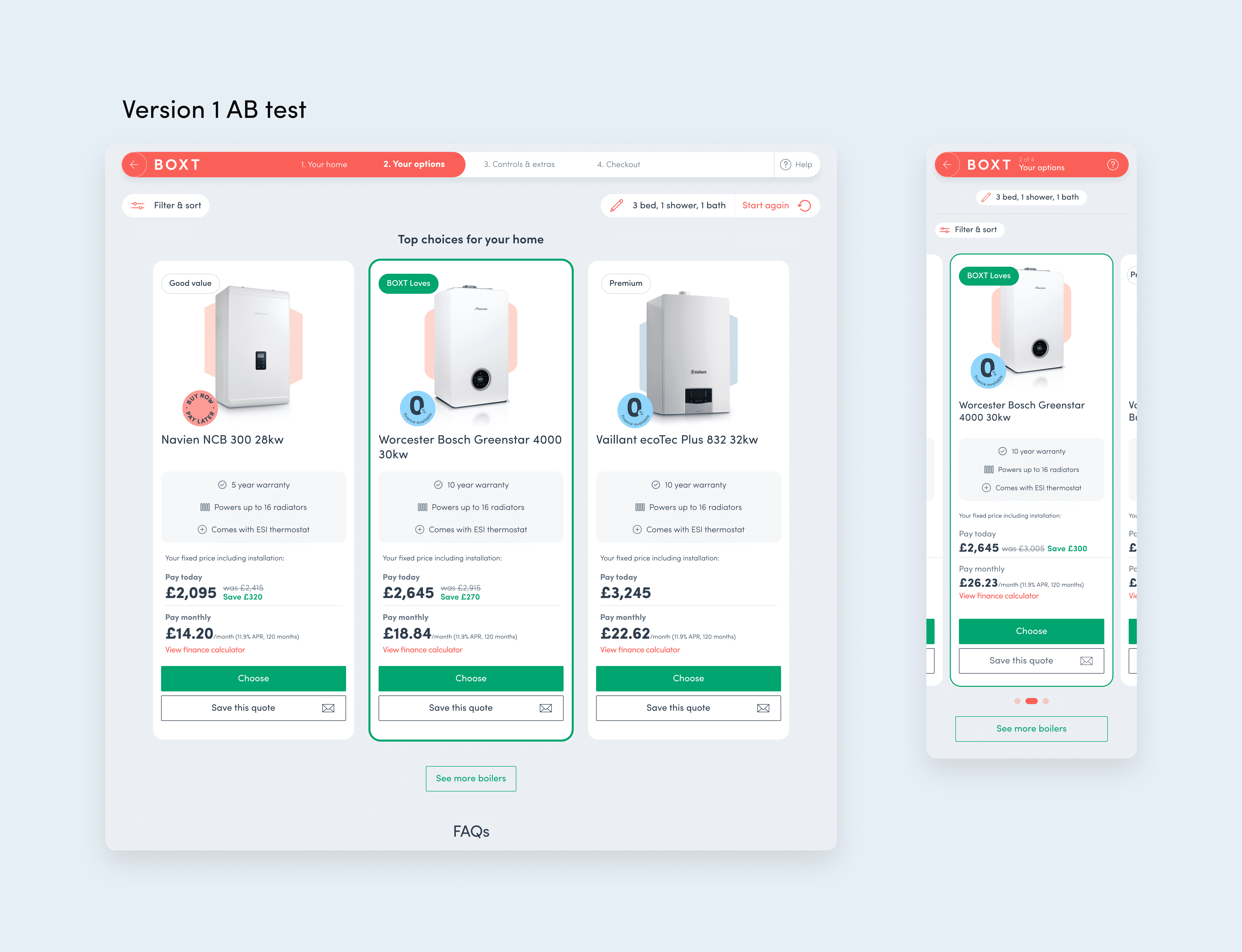

We’d seen a usability problem with the mobile carousel, so our next design iteration aimed to improve this. We added a new navigation element that aimed to both give the user an overview of the prices in one glance, but also act as a tappable navigation element. The user could swipe the carousel or tap on the tiles.
We also saw in the built version of the component there was a contrast issue with the other cards, so we added colour coded borders to each of them.
Our hypothesis was that if more users saw each of the options the price anchoring effect would increase their likelihood to convert, as making the choice of a boiler is easier.
We put the desktop design to 100% and ran the iterated mobile design to mobile users only.

The Desktop design was very successful leading to a +55% conversion rate increase. After the design iteration the Mobile component was positive, having a +10% conversion rate increase overall.
A requirement of the feature was to be able to push certain products more, for an increased share of sales of those particular boilers. We were very successful in using the anchoring bias to achieve this, increasing the share of sales for the top products by +8%, and reducing sales of "other" products by -19%.
Improved sales
Overall the feature had a positive impact on sales and product performance.
Improved User Experience
The new feature made it easier for users to see their top recommendations and to compare.
More control for Merchandising
The feature gave the merchandising team more control on how to push certain products.
Scalable to other product journeys
The feature is scalable to use on other product journeys within BOXT.