The checkout was going to be refactored into a more performant technology (Next.js), so while it was going to be rebuilt we took the opportunity to make improvements to the design to optimise it for conversion.
Timeline
From early discovery to release the project took around 4 months.
Background
The funnel progression rates showed that a large proportion of users drop off at the checkout. This is common in e-commerce, with the main drop off points in the funnel usually being the Product Listing Page (PLP) and checkout. We wanted to dig into why this was to see if we could improve this. As we had a high AOV, making an improvement of just a few percentage points could have huge positive revenue impact.
As the checkout is one of the most important parts of our funnel, we had to try to reduce the risk of releasing a version that had a negative effect. We had just onboarded a new server side AB testing tool called AB Tasty Flagship (now Feature Experimentation & Rollouts), so I campaigned for us to build the new checkout behind a feature flag on a new URL, so that we could test the new checkout against core KPIs before launching to 100% users.
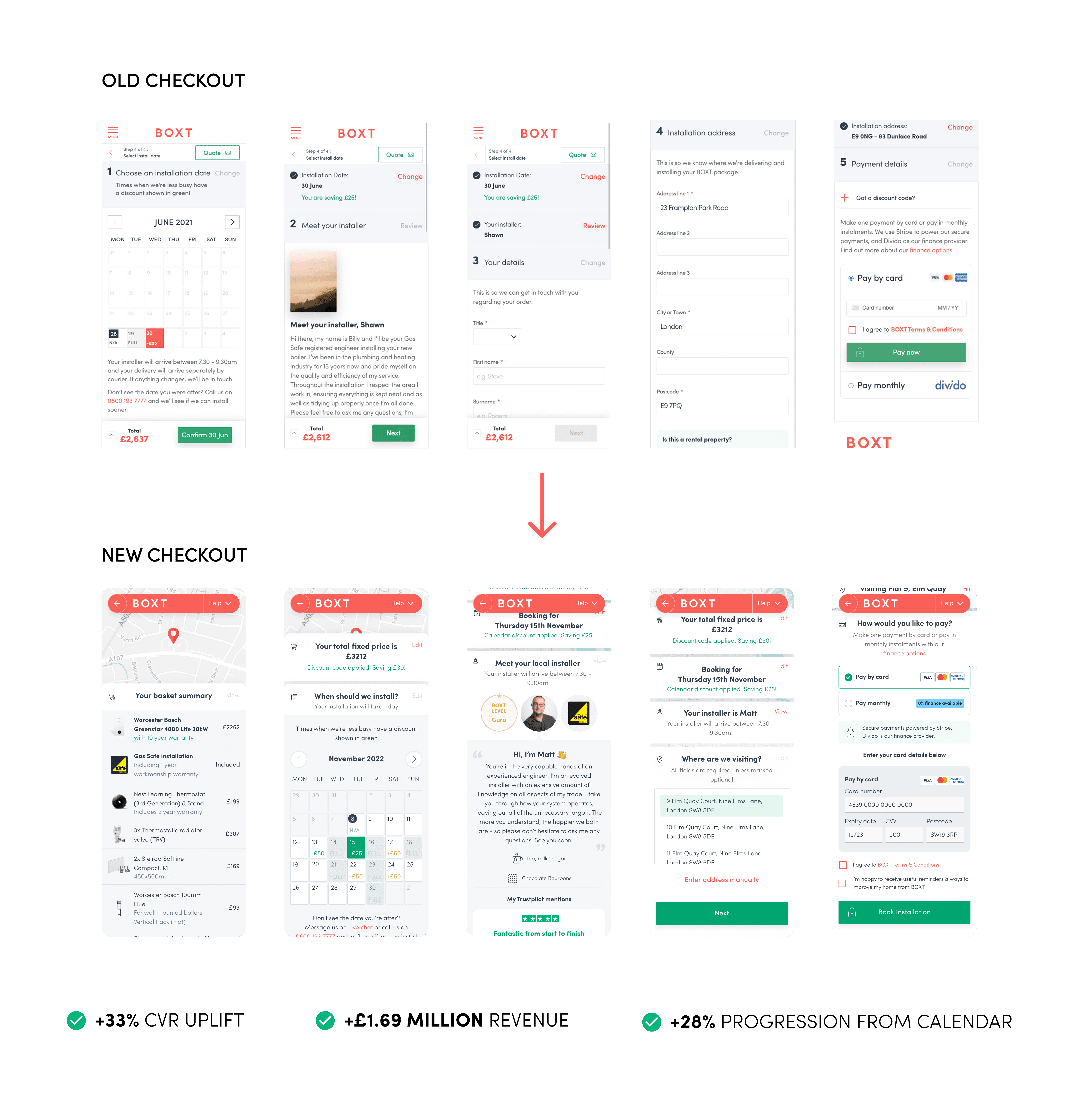
The new checkout was AB tested behind a feature flag for 1 month to ensure the new design was performing well, and the refactor hadn't introduced any bugs. It performed very well and was switched to 100%.
Conversion rate
+33%
REVENUE UPLIFT
+£1.69M
QUOTES SAVED
+323%
PROGRESSION TO INSTALLER STEP
+28%
ANNUAL REVENUE UPLIFT (PROJECTED)
+£21.2M
The process for this project was a bread-and-butter UX process, from qualitative & quantitative research, concept ideation, design, development, and building the checkout as an AB test to measure it before releasing it to 100% of users.
Funnel & page analysis
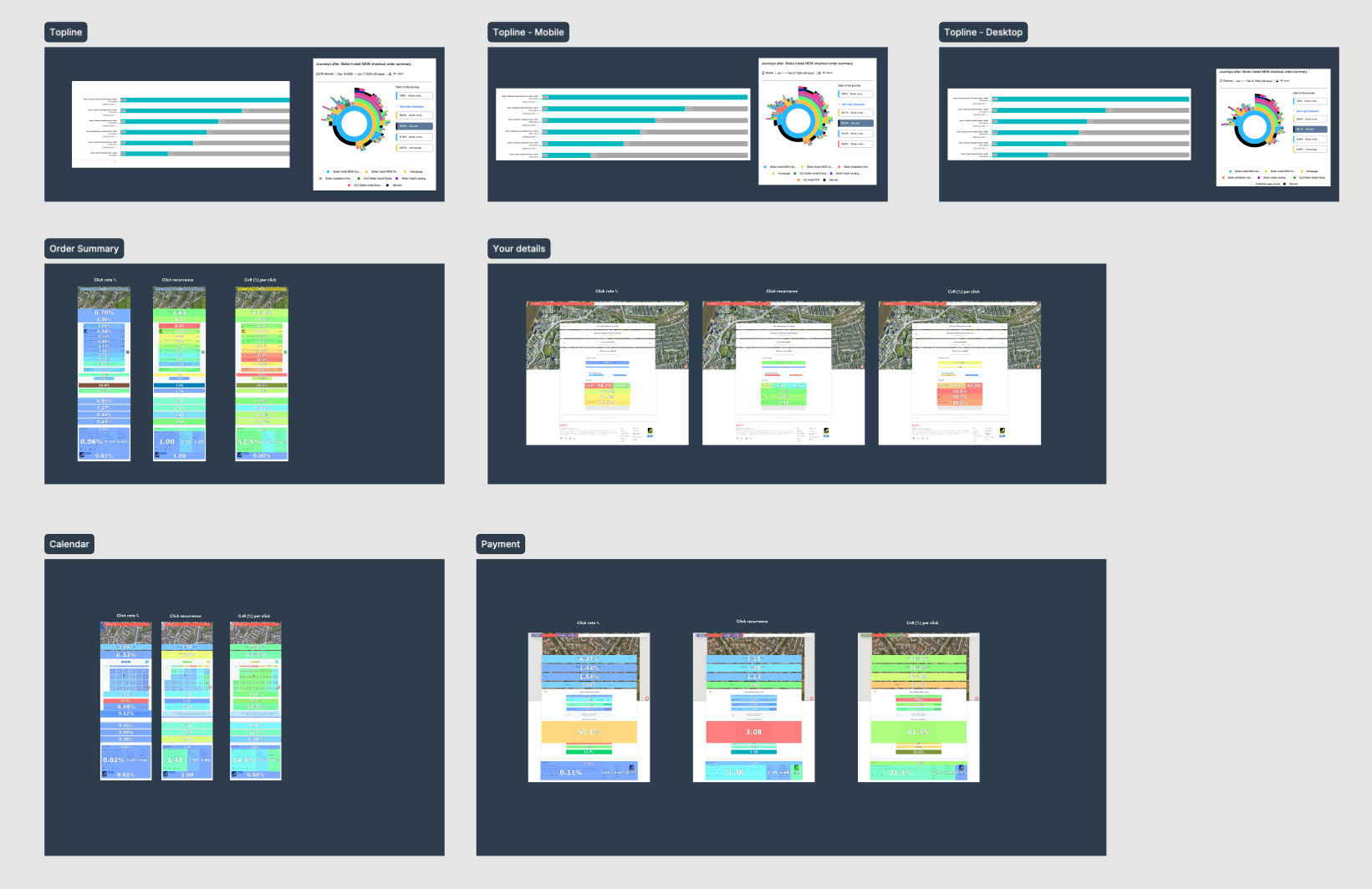
As a data driven designer, I always advocate that data analysis is almost always better for detecting UX issues with an already live journey vs just user testing. It is for this reason I carried out both funnel analysis and user testing for this project.
Using Google Analytics, and later Contentsquare, I gathered and analysed the trends in the following: conversion rates, funnel behaviour, device behaviour splits, heat & click maps, and behaviours around users that obtain a quote vs do not. The image below is a snapshot of the funnel analysis (blurred due to data sensitivity).

Hotjar surveys
I launched a series of HotJar user surveys on the checkout to get some quick qualitative insights as to why users may be dropping off at this step. I ran an open response survey at first, analysed the responses for themes, and then formed a new survey with the themes as multiple choice, to get a quantitive reading on what percentage of users aligned with each theme.

Design
The structure of the checkout would vaguely be the same, being a single page app where the user moves through vertically. The research outputs gave us a clear set of improvement areas that you can read about in the solution section below.
The design process we undertook was to identify comparator designs for best practice guidance for baskets/order summaries, create concepts and wireframes, and then mock them up as hi-fidelity designs.
There was not much service design to undertake in this project as all the API endpoints were already in-place, so the data already existed in our internal product management system, and customers would not be interacting with the checkout in a new way.
AB Testing & Release
We AB tested the new checkout using server side feature flags, using a platform called Flagship, from AB Tasty. We started at a soft launch to 3% of traffic, where we encountered issues. Once the issues were fixed we rolled the checkout to 50/50% until we reached a confidence level of 85% on the conversion rate KPI. We then turned the new checkout to 100% and carried out tickets to clean up the code of feature flags.

The new checkout was a reskin & optimisation of the existing checkout, and as such we did not change the way a user interacted with it. However we did uncover some pain points that we addressed:
A new order summary section
A new order summary section to replace the basket, which was opened by less than 1% of mobile users on old checkout.
Minimal navigation
New minimal nav, focussing the user on checkout, rather than jumping to other pages. This enabled us to introduce a new help menu with contextual FAQs, populated by analysing common checkout live chat questions.
Multiple ways to save a quote
The save quote in the old header had very low engagement, so we added inline CTAs to save a quote, based on the Hotjar survey feedback we had.
Pre-filled address lookup
We asked a user their postcode earlier on in the journey, so we could use this in the checkout to autofil an address lookup. All the user had to do was to choose their address from a list.
Refactored into Next.js
Refactored into Next.js which created a faster experience for users, and an easier to maintain and extend experience for our developers.
This section on the checkout is known as a delightful moment in every piece of user feedback we had received. We saw in the analytics that a lot of users go back-and-forth between choosing dates and the installer step to see which installer they would be assigned. In addition to this we had feedback that customers wanted to know a bit more about the engineers level compared to other engineers. We had the hypothesis that by adding a “level” indicator it would help a user become more informed about the installer they had been assigned, and would lead to less back-and-forth.
We also hypothesised that it would also positively influence engineer behaviour, as we knew that engineers came to the website to look at their profile.

We AB tested the new checkout using server side feature flags, using a platform called Flagship, from AB Tasty.
We started at a soft launch to 3% of traffic, where we encountered issues. Once the issues were fixed we rolled the checkout to 50/50% until we reached a confidence level of 85% on the conversion rate KPI. We then turned the new checkout to 100% and carried out tickets to clean up the code of feature flags.
We analysed the new checkout test, looking at each KPI & behaviours by device, using a mix of Contentsquare and Adobe Analytics. We produced an analysis deck that I presented to stakeholders and the platform team. Example snippet of some of the analysis in Figma below.